In designing the site, we had a few goals:
- Dead simple - we really wanted to make it extremely easy to get going. We know that a lot of Microsoft customers had heard a little about Hadoop but didn't know too many details. We wanted to get them started running jobs on their cluster as soon as possible.
- Full functionality - At the same time, we wanted to make sure that experienced Hadoop users could access the full power of Hadoop in an convenient manner.
- Show our value-adds - Finally, we wanted to showcase some of the value-adds we are providing for Hadoop - things like our interactive javascript and our Hive connector for Excel.
Simplicity is usually achieved by limiting features, so we started by really thinking about what is the minimum # of features we could expose. This led us to a short list of things:
- create and release clusters of different sizes
- create and monitor jobs
- set up external storage from Amazon S3 and Azure Blog Store - this is especially important for the elastic service. When a cluster goes away all of the data on the cluster will be lost. We know people who want to save their data will want to move it to cloud storage.
- connect to get data in and out via FTP and ODBC
- make sure their cluster is not out of storage space
- allow the user to RDP into the head node for any additional advanced functionality
With this list in hand, we quickly built a web service that exposed these functions and connected it to a rough and ugly UI so that we could test end-to-end scenarios as quickly as possible. This web site was just basic un-styled pages that looked like this:

Doing things in this way allowed us to decouple the web service and back-end programming from the front-end programming.
Once this was done, we could focus effort on the client experience. A major part of hadoop is waiting for jobs to finish. So a primary design requirement was to be immediately glance-able. We wanted you to see how your jobs were doing immediately. We also knew that we wanted to make it look very clean and modern. A lot of hadoop's native UI is extremely busy. For example, here is the task tracker:

As you can see, this page is full of information that 95% of the time is not needed. Most of the time, all you want to know is "is my job done or not?"
In addition, we wanted a UI that would scale nicely across devices. This is especially important with a cloud service. Since you can access your data anywhere, from any device, you should make a UI that works on any device.
After sketching ideas on paper and the whiteboard, we settled on a design that used Live Tiles as the primary element. Live Tiles are part of Microsoft's new "Metro" design language and are probably most familiar to folks from the Windows Phone. A Live Tile is basically just a large square navigation button that has a summary of the information it will show on the button itself:

For example, the Outlook live tile shows the # of unread messages, while the People tile shows the images of the people in your address book. We mocked up the entire UI in this way using PowerPoint. Here are a few slides from the mockup deck:


PowerPoint is a very handy low-fi prototyping tool. You can make screens very quickly, and you can even wire them up so that they can respond correctly to clicks. It sort of reminds me of working with HyperCard back in the day.
Once we are happy with the PowerPoints, we go into visual design. The key for the visual design was really making sure that the colors and shapes rendered well on different sized displays. We did this work in Photoshop initially, and then coded it in HTML 5. The web site itself is developed in ASP.NET MVC, using HTML 5 and JQuery.
Once the site was functional, we would do frequent reviews of the screens. Personally I like to do these standing up, with all of the pages in front of me. We have a wall in our our office where we hang the print-outs of the entire site:

These are up all of the time, and anyone on the team can mark them up or make notes on them. We have red sharpies just for this purpose:

The goal is to make sure that everyone on the team can see the current state of all pages in the site at all times. Any bugs or suggestions are captured daily and added to our issue tracking system (we are using JIRA).
We also do a lot of testing on devices. This lets us catch small mistakes that might otherwise not be noticed until it is too late to fix them. We tested on Windows machines, Windows Phone 7, iPhone 3, iPhone 4, iPad, and MacBooks, on IE, Safari, Chrome, and FireFox. Because we committed to HTML 5, we only bothered to test browsers that supported that. This simplified the test matrix dramatically.

iPad 2

Windows Phone 7.5
Testing on devices - especially the lower-resolution iPhone 3 - helped us to refine the visual design of the live tiles so that they were still readable on the small device.
In the course of testing, we actually found some significant missing features. For example, we knew that many people who would want to check out Hadoop may not have sample data sets or map/reduce jobs just lying around. So we created a built-in sample library. The sample library contains sample programs and their related data sets all ready to to go, that can be deployed to your cluster in a single click. Not only does this prevent users from having to surf around the web trying to find samples, it also lets the selection and deployment happen from a mobile device that does not have a file system. So you can deploy a sample and experiment with different parameters all from your iPad.
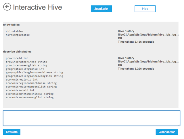
Here are a few shots from the final portal:


Hopefully this gives you a peak behind the design process of the portal. I would love to get your feedback. One of the great things about web development is that we can push out improvements on a much more frequent basis. We already have lots of ideas for improvement, but I want to hear from you as well.
In the course of testing, we actually found some significant missing features. For example, we knew that many people who would want to check out Hadoop may not have sample data sets or map/reduce jobs just lying around. So we created a built-in sample library. The sample library contains sample programs and their related data sets all ready to to go, that can be deployed to your cluster in a single click. Not only does this prevent users from having to surf around the web trying to find samples, it also lets the selection and deployment happen from a mobile device that does not have a file system. So you can deploy a sample and experiment with different parameters all from your iPad.
Here are a few shots from the final portal:

Portal Home Page

Create Job page

Interactive Hive page
Hopefully this gives you a peak behind the design process of the portal. I would love to get your feedback. One of the great things about web development is that we can push out improvements on a much more frequent basis. We already have lots of ideas for improvement, but I want to hear from you as well.
No comments:
Post a Comment