Sunday, March 25, 2012

Metro in LOB apps

I was talking to some folks about Metro the other day.  For those who don't know, Metro is Microsoft's new design language for Windows Phone, XBOX, and soon Windows 8.  Without naming names, let's just say that these are people who are in charge of delivering line-of-business applications for a Large Pacific Northwest Software Company.   And the topic was how to design these sorts of applications for Windows 8.

In a previous post I talked about some of the challenges that Metro presents to the Microsoft developer ecosystem.  Now, after talking with these internal IT developers, I am more concerned than ever.

The Fallacy of Consumer vs. Enterprise
The first thing that struck me was the active debate the team was having on whether or not Metro was even appropriate for this sort of "enterprise app".  There were two serious misunderstanding here.

First was the mistaken belief that Metro is designed for consumer apps.  This just isn't the case.  While it is true that Metro made its first appearance on a consumer device - the Zune - Metro is actually inspired by the design of things like airport signage.  In other words, Metro was inspired by the need for information management, task support, and efficiency - all things that matter even more in a business app than a typical consumer app, where efficiency is less of a concern.  In fact, when I am doing Metro-style design, I often get into the same mental space I would be in when doing form design.

But there is an even more fundamental misunderstanding here, which is that there are even such things as consumer vs. enterprise applications anymore.  Much has been written about the "consumerization of IT.  As devices - led by the iPhone and iPad - become increasing useful, personal, and delightful, users are demanding that they maintain these experiences in their work environment as well.  The zeitgeist is that the tyranny of IT is over.  No more will employees put up with inferior user experience just because there is some corporate mandate.  The signs of this are everywhere, and the sooner that you as an IT developer can get on board, the better life will be for both your users and yourself.

HeadTrax:  A Quick Case Study
To show the sort of thinking that is required, let me go through a mini mythical case study of a typical LOB app.  My inspiration for this is the headtrax application used inside Microsoft.  Like many internal applications, Headtrax is basically a front-end for a database - in this case, a database of personnel records.  Everything that can be done that in some way affects a personnel record is done through this app.  As such, there are hundreds of commands spread across dozens of pages.

A typical Line of Business App
I like this example because I think this is fairly typical pattern in this sort of app.  If want to Metro-ify it, we have our work cut out for us.  But let's break it down step by step:

Step 1:  How many apps is this, anyway?
If you go through Headtrax, the first thing you notice is that it has a ton of functionality.  Everything from updating your emergency contact to extending a vendor is done in the app.  The first mental shift to overcome is in thinking that a Metro version of headtrax would even be a single app in the first place.  In the age of the phone, monolithic apps are going away and constellations of simple applications are taking their place.  Think of the Apple iPhone mantra:  "There's an app for that".  By breaking headtrax down into different apps, each app can be custom tailored to the task at hand.  Users only need to install those apps that they need.

Turning one monolithic app into a collection of more focused apps
Conveniently, many of these sort of apps already have a list of shortcuts or common tasks bubbled up to the top.  These make a great starting place for thinking about how to break up a big app into little ones.

Finding and managing apps?  There's an app for that!
Multiple apps used to be a big pain - they were hard for users to find, hard to install, hard to update, etc.  But in the age of the app store, these problems have all gone away.  Users are very familiar with the pattern of searching an app store to find the apps they want.  The app store handles access control, installation, and even updating.

The Windows 8 app store
More is not always harder
One the the common concerns I hear about making a single traditional monolithic LOB application into a dozen or more focused apps is that the development cost will be much higher.  There are more apps to write, more to test, and if the database schema or other underlying condition changes, everything has to change.  It sounds like a reasonable concern but when you go a little deeper you will see this goes away.  Consider:


  • a single project in your development environment can easily support all of the related apps.  This makes it easy to have shared libraries, classes, and data models and ensure any change causes the appropriate updates.
  • although more apps mean more apps to test, this is more than offset by the fact that simpler apps are much easier to test than complex apps.   Simple apps eliminate many of the combinatorial issues that arise in monolithic apps.  They also tend to have much simpler UI.  
  • coordination and dependencies between developers on a project is often a considerable time cost.  Independent applications need much smaller teams and can be developed much faster.  So instead of 20 developers all working on a single app, you can put those 20 developers into 5 teams of four, making 5 independent apps.  


Step 2:  Getting rid of the grids
The next most common question I get is people asking how to do tabular in Metro.  While there are several nice visual designs for grids out there that have a pleasantly clean Metro look, the first task is deciding if a grid is the correct tool at all.  In many cases, the answer is "no".

While there are some times where a grid is definitely the correct UI, many times a grid is used just because it is the easiest thing to use to show a databound view.   So how do you know if a grid is the right thing, particularly if you are not some kind of information architect?

I've found that the simplest thing is just to ask a few questions.  Let's use this grid as a typical example:

A standard tabular grid
The first question is, are there any columns we can get rid of entirely.  For example, anyone really ever need to see the detailed employee ID number?  This is probably only useful in rare cases where you need to search by ID.  And how about the date of birth?  Why is this important?  I might ask around and find out the  only people using that are the admins, planning for birthday parties.

After you eliminate columns you don't need, the next step is to ask if all of these columns are actually of the same importance.  Are they used with the same frequency and used in the same way?  If they are, then a grid is probably the right UI.  But if the columns are used with different frequencies and/or in different ways, then you are better off designing a more appropriate representation.

For example, in this case I might mostly care about peoples names and titles.  I might be secondarily interested in knowing where their office is.  Finally, I might want to know about upcoming birthdays.  Based on that, I might do a UI more like this:
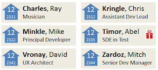
A more Metro way of showing data in a grid
If I really wanted to know more detailed information, I could get that in a drill-down.  You can still sort items or do searching in this format, just like we get in the windows explorer when we put it into another view.

Concluding thoughts
So hopefully this is useful for thinking about re-doing your LOB app for Metro.  And you don't have to wait for Windows 8, either.  This sort of design is also great for the web and mobile devices.

If you have good examples of LOB app redesigns, please share them in the comments.


Friday, March 16, 2012

The Challenge of Metro

By now most people have seen Metro, the new design language from Microsoft, either on a Windows Phone or in the previews of Windows 8.  Overall, people like Metro.  It is clean and modern while also somewhat timeless in its minimalism.  It works well with touch and gestures but is also great with mouse or even keyboard.

Metro in the Windows 8 Developer Preview


So, on the one hand, this is a great time for Microsoft and Design.  We finally have an overarching design language we can be proud of, and the company has made impressive strides in getting many of its notoriously independent product groups to embrace it.   So Windows, Office, Xbox, WinPhone, and dozens of others will all be getting the new look shortly.  And there have never been more senior, principal, and even partner level UX people in the company.  

So why am I worried?

I’m worried because Microsoft has always been about the ecosystem play – the big tent – and not about the boutique.  And I don’t think the ecosystem – both inside and outside of Microsoft – is ready for Metro.

To understand the concern, let me take you on a little walk down memory lane.  Our journey starts a little over a decade ago, back in 2001, when Microsoft released XP.  At that time Microsoft create a new design language called Luna.  Remember Luna?

Luna theme in XP
Luna wasn’t really a whole new UI paradigm the way Metro is – it was primarily a visual theme, and it could be applied to existing Win95 or even Win 3.1 code with a fair degree of success.   Many people were exposed to XP as their very first exposure to a computer, so the design was intended to be bright, cheerful, and obvious.  It was not super ambitious.

And here lies the seed of our problem.  Luna was easy to implement, and hard to screw up.  As a design, it was very forgiving.  You could have controls that were not quite aligned, screens that were too dense, icons where you didn’t need them, and so on, and your stuff would still pretty much fit in.  It was a low bar, and thus was easy to hit.

Later, when we did what became Vista, we had a new design language called Aero.  This was a little more ambitious.  For Aero, we were not going after new computer users.  People already knew how to use a computer.  We wanted to make the computer experience more comfortable and stylish.   Aero added more emphasis on layout and white space.  We added more subtle visual cues.  Overall, we turned down the volume (visually) on the UI to make the workspace more calm.  We added transparency and a little animation.  It looked great.

Aero in Windows Vista
But we immediately found a problem.  The Windows design team created designs for all of the various core pieces in windows, like explorer, the photo browser, and so on.  But there were still dozens of other groups in windows making things like control panels and utility apps that had to do their own design.  And these teams really struggled.

At that time, I had a discussion with Don Lindsay, who was one of the primary architects of Aero, about the cost of the design.  Don was of the opinion that software was different from most manufacturing.  You could increase the quality of the design without increasing any other production costs.  I disagreed.

Aero was harder for teams to get right.  You had to understand about effective use of white space, which was hard for teams without a graphic designer.  You had to understand what to make subtle and what to make obvious.  You needed to understand motion.  But that was just the up-front cost.  These designs were also harder for developers to implement.  Animation is harder to code than static screens.  Old techniques like automated dialog layout that looked acceptable in Luna looked like crap in Aero.  And then there was the testing cost.  In Luna, small errors didn’t really jump out.  If a few things were out of alignment, it wasn’t so glaring.  But in Aero, even small mistakes were very noticeable. 

So truly embracing a new design language really requires a serious commitment of time and expense to get that language right.  This was not budgeted in the Vista planning process, and as a result most teams came up short.  It was even worse outside Microsoft.  Many third party developers simply did not have the time and money to properly make their products conform to the Aero design language. 
And now we get to Metro.

Metro (for those who don’t know) was originally designed for the Zune.  It is kind of an evolution of the design thinking in Media Center, Microsoft’s television UI. 

Media Center UI
Metro got its inspiration from the clean and timeless graphic design you see in posters and brochures that provide information, such as the signage in a metropolitan subway station or airport.  Hence the name “Metro”.


http://www.flickr.com/photos/everydaylifemodern/page8/

The first thing to point out is that doing this sort of design is hard.  It difficult from a visual perspective.  You have to understand a lot about typography.  Things like the weight, leading, and kerning start to matter.  Empty space, negative space, balance, hinting, flow, and so on all become crucial in that the lack of them will immediately jump out.  Most people who didn’t graduate from design school don’t even know these things exist.  Many people who did graduate don’t use them very well.   And in the starkness of Metro, there is no place for mediocre visual design to hide.

But the visual part is just the tip of the iceberg.  The real challenge is that Metro requires a deep rethinking of the information architecture itself.  You can’t just take the same information you have today and let a graphic artist “make it Metro”.  It doesn’t work that way. 

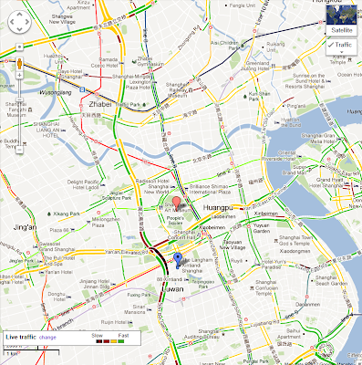
For example – here is a map of Shanghai that is showing the subway maps and stops.

Map of Shanghai
How do we make this Metro?  By doing this:

Map of Shanghai - Metro-style
Think of the process that went in to making this map.  Someone had to decide that a whole bunch of stuff that is factually accurate and even relevant to users of the map just didn’t matter.  They abandoned any accurate sense of travel time, distance, actual physical proximity, and even the actual shape of the tracks.  They decided to remove all street names, landmarks, and every geographical feature except the river. 

Doing this requires someone who is not only an expert in design, but also an expert in the domain of maps and even in the city itself.   It also requires a certain boldness and confidence – confidence to go into a meeting and convince a bunch of non-designers that all of those things really don’t matter.
So now look back at that street map.  THAT is your product now.  Who on your team is going to make it into the subway map for Metro?  Is there any individual or even set of individuals who know enough about design, and enough about your product, to make that kind of radical redesign?  And if they do exist, are they empowered in your organization to actually make that change happen?  Do you have the development team that can pull it off?   And does your test/QA team have the skills and tools to check for errors with highly polished design?  For about 98% of current internal Microsoft teams, Fortune 500 IT groups, and even ISVs, the answer is NO.

Most teams are simply not prepared in any way - staffing, budget, etc. - to pull off great Metro redesigns.  And wose - Microsoft is not communicating to them that this is even necessary.  We just need to take a peek at the windows phone marketplace to see the future.  For every app that does Metro nicely, there are about 1000 more that really screw it up and turn it into an ugly abomination.  And those are just phone apps, which tend to be a) small and b) created just for the phone.

For desktop apps, most of the apps are going to be large existing apps.  The developer is going to look for easy solutions.  They are going to want something as easy as moving from WIn95 was to Luna.  And god help us, Microsoft is delivering it to them.  I have already been exposed to PowerPoint templates that turn your current presentation into Metro.  How?  By making all of the Headings into Monocolor boxes with white text in them.  If that all people think of Metro, we are all in trouble.